Perhaps I’m the only one who feels this way. It really bothers me that chess book diagrams do not have coordinates listed. This means that I have to spend some of my few brain cells figuring out how to set up a chess board to analyze the position in the book. Doesn’t seem like it would be hard to include this small feature.
.
I do not share your preference. The printed coordinates are not useful to me, and they just make the diagram look cluttered and too busy.
However, I do have a loosely related pet peeve about chess position diagrams, and a corresponding idea…
It would be nice if the king icons had an asymmetry that always leaned (or pointed or however) toward the ‘a’ column edge (or always to the ‘h’ edge). Or at least the just White king could have the asymmetry (for those worried about fitting the extra king codes into a font).
This would mean those busy coordinates would never be needed to clarify whether the top or bottom row is row 8.
For example, this would help when an endgame is reached in an openings book that followed a game from Black’s perspective.
Then authors of opening repertoire books for Black would feel more comfortable appropriately displaying their diagrams from Black’s perspective, instead of inappropriately displaying from White’s perspective.
As it is, perhaps the authors of those chess books have avoided displaying from Black’s perspective due to worry that flipping the diagram would necessitate those busy coordinates?.
King is emperor, Queen is dame, bishops associate with cardinals and friars, any knight should be bold and gallent, and you can associate rooks with both architecture and houses.
My first preference personally is that diagrams should always display rank 1 at bottom, regardless of who is to move or book’s perspective. It’s my one gripe with the Chess Tactics Server that it reverses the board automatically and it is not an option to disable. I doubt I’m alone with my desire, but I don’t know how alone I am. Then again, many may still find using FAN questionable as opposed to SAN. Maybe I’m just getting curmudgeonly in my middle age.
Diagrams are generally created using TrueType fonts these days. Many fonts already include rank/file characters, while there is no defined characters for a kingside dot indicator. (Never seen a font with extra characters for that, anyway.) In most fonts two separate characters are required for each piece type, depending on if it is on a dark or light square. It would, in general, be far easier to have rank and file designations rather than try to design new fonts with added characters (for Kingside indication) and then persuade everyone to use those new fonts. I would think it far easier still to promote adoption of simply putting a “1” to indicate which row is first rank… Not necessary to label the whole diagrams, just show if first rank is top or bottom.
I was just testing ChessBase’s “print diagram” and “print game” features. Coordinates can be turned on or off. I can’t figure out if it is possible to flip a single diagram in a game, though it is possible to flip all diagrams in a game. Another option is a move indicator. If used, white to move is a white circle and black to move is a black circle on the right side of the board. The clever bit, though, is that the circle is always placed on the color’s home rank regardless of orientation.
Easier to show it.
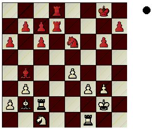
Black to move, a1 is lower left corner. 8th rank is therefore ‘top.’
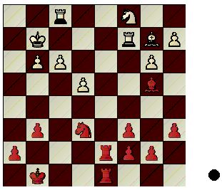
Same position with flipped orientation. Black to move, a1 is upper right corner. 8th rank is ‘bottom.’
To my own surprise, I find lettered-SAN slightly preferable to figurine-SAN.
One intellectual reason is the unsolved problem that the white piece icons used for pieces in figurine-SAN look awkwardly the same in both live moves and analysis moves; although live moves tend to be bold.
Perhaps black icons could be used only for live moves, and compared to white icons the black icons would seem bold.
But then there is a problem when dimensions are crossed — when someone wants to encode the color of the moving piece by using a white figurine/icon for White’s move, and a black icon for Black’s move: only one will seem bold.
This color encoding was done in the dubious book “My 61 Memorable Games”, and in the .EPub book at the this Http URL:
New or updated chess fonts would have to add two more white king icons (or be daring and add a slight asymmetry to the existing white king).
It is not necessary that everyone suddenly adopt the slightly asymmetrical king icon, it is sufficient that it becomes available.
I see your point. But visually a lone “1” might look a bit inelegant, I am unsure.
Your next suggestion is interesting, and it made me realize a weakness in the common Chess Alpha font; a weakness that is also in some other chess fonts…
Unfortunately, the Chess Alpha font uses the same color-agnotic icon to indicate the color that is on-move. It encodes color by position only, an avoidable limitation which this forum thread brings to light.
In contrast, the white vs black dot that you mentioned encodes color by both its own color and its position. Those dual modes enable the dots to a more efficient solution to encode all the info we want.
.
I’ll throw my 2 cents in: I too think having the row and column designations on the diagram would make them too cluttered.
Plus there are real space limitations, so if you include the labels, it would shrink the board a smidgen. But any shrinkage of the diagram board size would be unwelcome in most books with 2 columns per page, which is standard in many chess books.
There are some books that have put algebraic notation inside a border that surrounded the diagrammed chess board. Offhand, I think that “Attacking the King,” by J. N. Walker has that format. It seems to be a standard practice in many of the books coming from Olms Publishing. The diagrams are slightly larger than the normal ones you see in other chess books. The lettering and numbers are small and unobtrusive. Cost and space must be the major considerations for a publisher not to put algebraic notation in a bordered diagram. While such diagrams make the books look classier, they are also a bit more expensive.